
7 QC TOOLS FOR QUALITY IMPROVEMENT
Quality control ( 7 QC Tools ) is important in any industry. When producing parts or products, the ability to monitor, troubleshoot, and adjust manufacturing processes is necessary for companies to remain efficient and competitive. To manufacture products consistently to a required standard, manufacturing methods must be measurable, adjustable, and repeatable ourselves.
This is an obvious fact that for any industry to grow, it has to constantly improve its processes and quality parameters. This becomes more important in the case of highly regulated and ever-advancing industries. There are many tools and methods available to identify, investigate, evaluate, and resolve quality problems. Active voice: All kinds of industries widely use seven basic quality control tools.The seven tools are popularly known as “7 quality control tools” or “Seven basic quality tools.” We use these 7 quality control tools to collect, collate, analyze, interpret, and report data.
Table of Contents
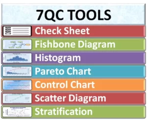
The 7 quality control tools
- Cause and effect diagram (also known as a “fishbone diagram” or Ishikawa diagram)
- Check sheet
- Control table
- Histogram
- Pareto chart
- Scatter diagram
- Stratification (alternatively flow chart or run chart)
When should I use 7 QC Tools?
7 quality control tools can be carried out during the quality management, quality improvement process, Six Sigma implementation processes, or even the regular PDCA cycle for the purpose of improving quality management. During the first phase of measurement and identification, you can use a fishbone diagram, also known as a cause and effect diagram, a Pareto chart, and a control chart. During the evaluation and analysis phases, we can create scatter diagrams, histograms, and checklists. We can constantly improve quality by using a control chart.
Benefits of 7 quality control tools
Companies use the 7 quality control tools to improve their management and production processes and achieve better product quality. These tools are structured and fundamental instruments for doing so. From evaluating and examining the production process, identifying key challenges and issues, to controlling present fluctuation in product quality, and providing solutions for future defect prevention, 7 QC tools make it easy to understand and implement, are very effective. Listed below are some of the top business benefits of 7 QC tools.
- Provides a more structured path for problem resolution and quality improvement.
- Easy to understand and implement but extremely effective
- A scientific and logical approach to problem solving
- Follow the 80/20 rule, i.e. get 80% result with 20% effort
- Improve the quality of products and services
- Help identify and analyze problems during the process.
- Fishbone Training Assistants in Root Cause Analysis and Troubleshooting
- Improve customer experience and customer satisfaction
Cause and Effect Diagram (Fishbone Diagrams)
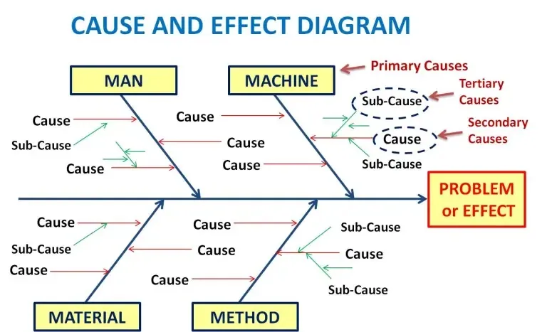
Fishbone diagrams, also known as cause and effect diagrams, are a quality control brainstorming tool used to help identify the root cause(s) of a problem by looking at all possible variables.
When using these diagrams, a central problem or focal point, such as a defect or quality problem, is placed at the head of the “fish” becomes:
When using these diagrams, a central problem or focal point, such as a defect or quality problem, is placed at the head of the diagram.
The “fishbones” serve as a way to visually organize all of the possible variables or causes that may have caused the core problem and classify ideas into categories for further investigation.
A person names a fishbone diagram because of its skeletal resemblance to a fish and it is widely used. Using the principle of cause and effect diagrams, we can trace various factors or causes back to an effect or problem. Using the cause and effect diagram helps to identify all the likely factors that could lead to an effect.
The 4 main branches identify the probable causes as being classified into them, named 4M.
- man
- machine
- Materials
- Method
Advantages of cause and effect diagram
Extensive brainstorming sessions lead to the identification of numerous probable causes.
Reduce the probability of duplication of causes in the same diagram.
We can view all causes simultaneously.
Brainstorming cross-functional teams leads to broad thinking and brings many relevant issues to the table for action by management.
Helps prioritize causes.
Disadvantages of cause and effect diagram
Too much brainstorming can lead to the inclusion of many potentially irrelevant factors as causes. Too much clutter results in wasted time and resources.
Sometimes brainstorming can lead to a list of causes that are based more on “beliefs” than evidence.
Multiple causes have intricate relationships that are not easily discernible on a fishbone diagram.
Check sheet
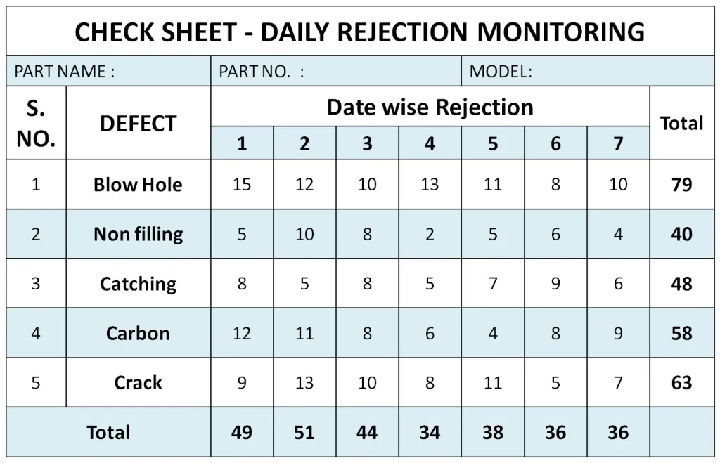
The check sheet is one of the simplest of the 7 quality control tools. It is basically a sheet to perform data collection. Real-time data is generated and collected in real-time at the same place. Using a control sheet, an individual tallies and collects quantitative information.
Users collect data using check sheets to identify and measure the impact of qualitative and quantitative variables on a process. When data is recorded on a check sheet, check or tally marks are used to indicate the quantity of what is collected, which helps to understand progress, defect patterns, and even the causes of defects.
This check sheet helps collect and tabulate the actual data that can help pinpoint the cause of a problem that may have been plaguing the business for a long time. It also helps to check the frequency of the problem. An individual can modify checklists based on the necessary information. An individual can modify checklists to fit the required information.
Advantages of check sheets
Easy and convenient application
It provides clear and easily actionable data.
Control charts
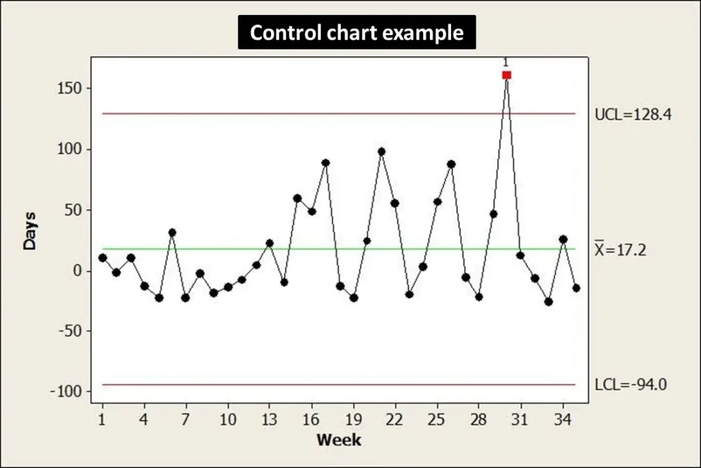
We use control charts to represent process performance over time. In a short time interval, we collect and compile subgroups of data points together. A single point on the control chart represents the average of the data points within a subgroup. Using the standard deviation, we determine control limits for the amount of variation within a sample data set. When subgroups exist beyond control limits or exhibit specific patterns or trends, we say that the process is no longer under our control.
Any type of manufacturing process considers variability intrinsic. Variability in a process can occur due to Random Cause (Unpreventable) and Assignable Cause (Preventable Cause).
Control charts help assess whether measured parameters are in control and meet predefined specifications.
In a control chart, we plot data on the x-axis against time. A center line on the y-axis indicates the mean, the line above the mean line indicates the upper control limit, and the line below the mean line indicates the lower control limit. These lines are based on historical data and sometimes also represent regulatory or guideline specifications.
This tool helps identify any out of specifications (OOS), out of trends (OOT) and process capability over a period of time.
Histogram

An individual uses a histogram, which is a type of bar chart, to represent the frequency distribution or the occurrence of each different value in a dataset. It groups the data into “cells” or “bins.” The histogram is the most used graph to evaluate the behavior of the process and show if the data follows a normal distribution or a bell-shaped curve.
Histograms and bar charts are the most common tools for displaying frequency distributions. Helps prioritize issues and identify areas that require immediate attention.
As illustrated in the histogram, chipping is the most common tablet defect. Indicates the area that is a priority and requires immediate attention from process engineers to improve the process and decrease the number of a particular defect.
Pareto chart
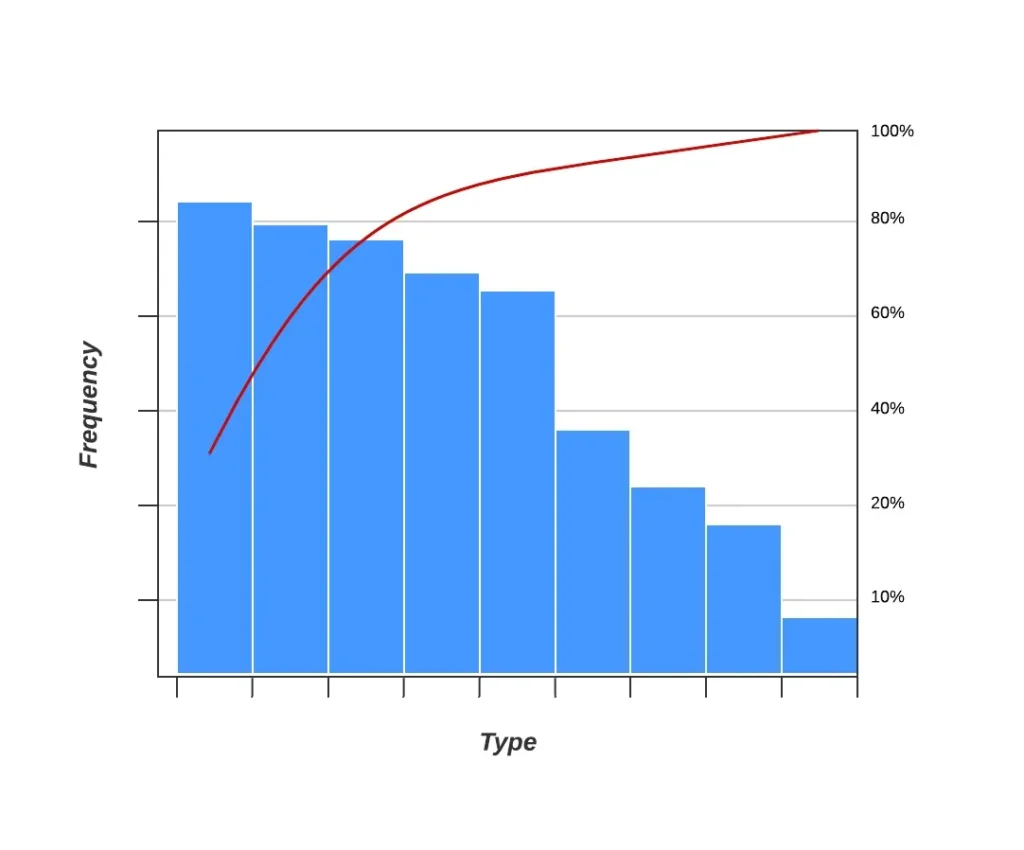
It is based on the 80-20 rule. 20% of factors cause 80% manufacturing defects when applied to the manufacturing process. The Pareto chart is a special type of histogram that includes bar and line charts. A running total is displayed as a line graph in a descending order of appearance for the bars.
In a Pareto chart, defects are ordered by the degree of contribution from the items. The tool identifies the priorities for solving the maximum defects, as it is responsible for the majority of them. It helps differentiate between a few major factors from many minor problems.
As illustrated in the Pareto chart, the manufacturing department makes the maximum number of deviations. Since manufacturing is responsible for almost 80% of deviations, proper corrective and preventive actions in manufacturing will drastically reduce the number of deviations.
Scatter diagram
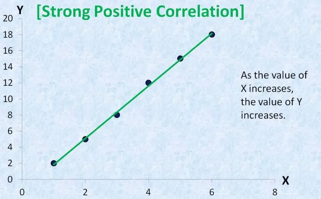
Using this tool, we understand the relationship between the two variables. The scatterplot displays the independent variable on the x-axis and the dependent variables on the y-axis. It helps to understand the relationship profile between two variables, which can be positive, negative, non-linear, etc. It also helps to understand if the two variables depend on each other.
By using scatter plots, we can quickly identify the correlation and represent the variables visually.
The user determines the type of relationship that exists between the process inputs and outputs, or the process characteristics and product characteristics.
Flowchart

It is a diagram that represents the process flow using various symbols to indicate the process flow. The flowchart indicates the process inputs, decision steps, and process outputs using various types of charts. All of these boxes are connected by arrows to represent the flow of the process. Flowcharts are prepared to analyze or design a process or program. Helps identify any potential problems in a process or program. It is important to note that some lists replace the flowchart with stratification or run charts.
You may also like